Martin and I got married January 25, 2014; and it was an absolutely beautiful day (very cold, but beautiful)! The day was a joyful whirlwind, and I'm so thankful to be married to this man. Below is a little glimpse of the day.
Wedding Photos courtesy of Leah's Opus Photography
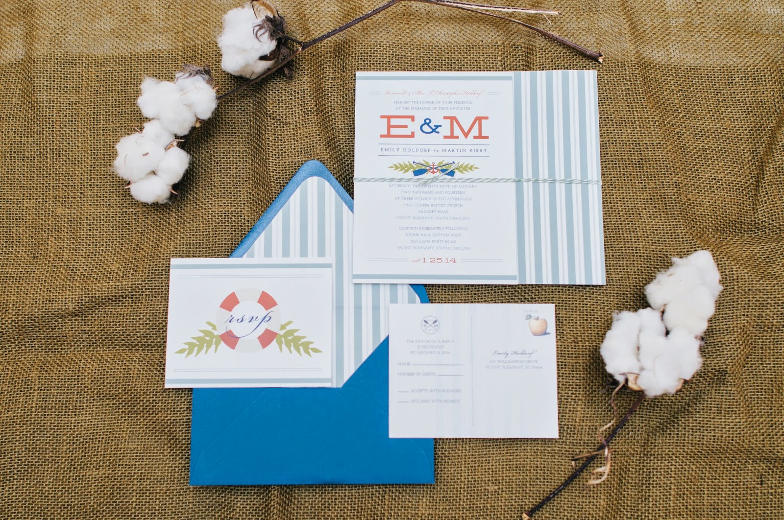
As a graphic designer, one of my favorite parts of the wedding planning was creating the stationery, including the save the dates, invitations, RSVP's, programs, and envelopes. To be honest, creating the wedding package was very similar to branding a company. You come up with a logo or emblem, and repeat it in little and unique ways throughout the wedding. Pretty soon, people start recognizing it as part of your wedding.
We decided to center the design around the location -- an old cotton dock in Charleston. So the concept was in the name; the design would focus on the dock aspect and have a casual boathouse/dock feel. After a little brainstorming, I decided on using the boat oars as the main repeating element.
The oars and our initials became the emblem (or logo), and all the pieces reflected some aspect of it.
The exciting part is tying it all together. The front of the RSVP card had a life preserver to complement the boat oars.
Above you can see the wedding program held by one of the groomsmen. Again, we have the repeating elements of the oars. Much like branding a company, each piece uses the same fonts, colors, and other graphic elements.
To signal guests, we added the emblem to our directional signs.
You can be very creative with this! We added menu signs that incorporated the crossed oars.
We decided to do save-the-date postcards, and added the crossed oars by the address location. (The little details are the best part!)
Photo taken by Texture Design Co. and Engagement Photos by Melissa Griffin Photography
But my overall favorite piece was the custom rubber stamp for the return address. It made such a statement on the navy envelopes. I'll definitely be using more custom stamps in the future.
Photo taken by Texture Design Co.
Hopefully some of this gives you ideas of how to create a unified look for a wedding package or quite honestly a business package.
Photo taken by Texture Design Co.


