Today's post is a little behind-the-scenes of the logo process for an upcoming blog, All Before Thirty. Shannon Reed will be launching the blog in summer 2015. In the meantime, I definitely recommend following her encouraging Instagram feed.


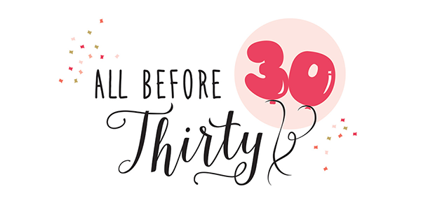
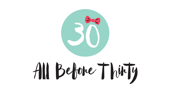
Pictured to the right are the initial logo ideas. I typically try to send the client 2 to 3 initial options that will be a spring board for the rest of the branding. Normally, I try to send the logos in black and white so that color does not distract...I obviously broke my rule this time. I just couldn't wait to show the color versions.
"The purpose of All Before Thirty is to come along side and love on other ladies in their journey. (This is a community where, if we lived in the same town, you would come to my house for coffe with no makeup and I'd probably have dishes in the sink.) Just meeting each other where we are, where ever that may be. I wish to point them to Jesus Christ and hope to show that no matter how difficult or hurtful of a situation they may find themselves in, there is hope and freedom in a relationship and walk with Jesus Christ as our Savior..."
Shannon described her desired logo as "Exciting, Fun, Stylish, Southern and Unique." Each of the logo options is a different take on those adjectives.
OPTION 1: The idea of a celebration...
OPTION 2: Playing up the fun, girly side...
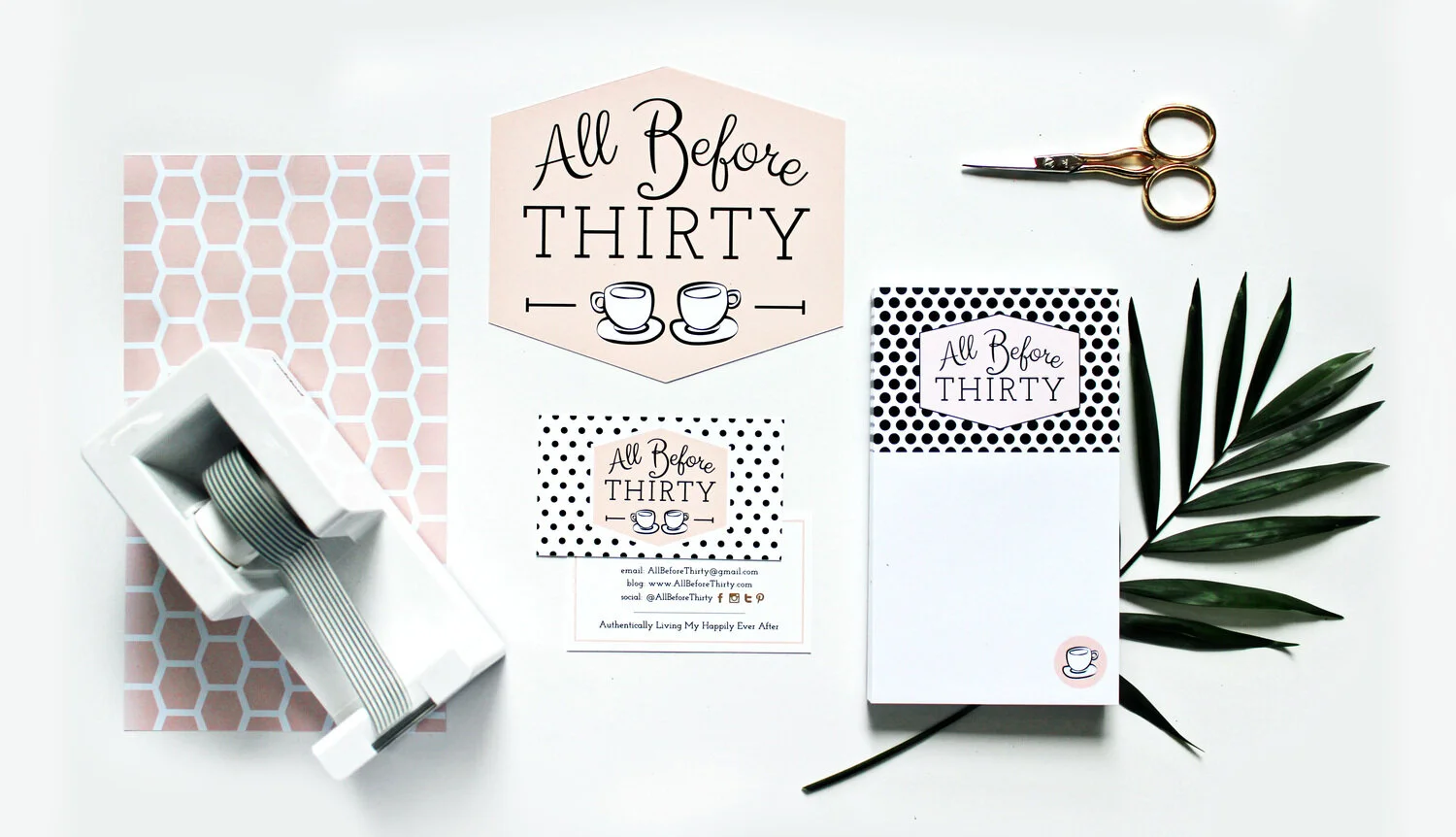
OPTION 3: The idea of coming together...very southern and stylish.
If you follow the Texture Design Co. Instagram feed, then you already know which one was chosen! ;) But I'll be sharing more of the process in the next blog post! #staytuned
Best,
Emily Kirby


